Behind the scenes reference Part 1

September 18, 2014

Since Starbunny, Inc. takes place in the fictional world of Hoppiton, I didn’t expect how much real world reference would end up going into the art process! I’ve taken tons of photos and pulled from various reference from all over the galaxy!

Here’s a step-by-step look at one of the busiest panels so far…

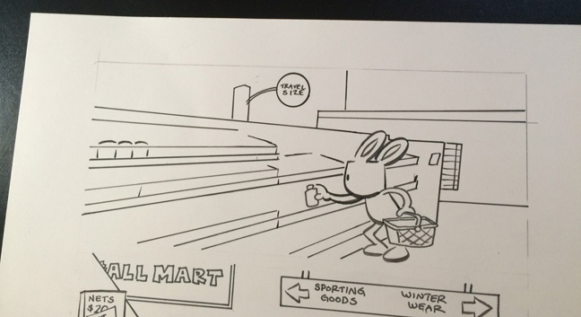
I wrote page 37 (like all the others) as thumbnails, with loose drawings hinting at backgrounds, but leaving the specifics for later.

starbunny_travelsize_process_0

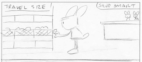
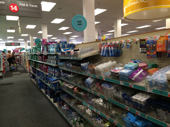
Before I began penciling, I did a scouting trip to the travel section of my local CVS. I took photos from several angles to see which would work best.

starbunny_travelsize_process_1

I penciled and inked the main character (using a Windsor Newton brush and Speedball India ink), indicating where the background would go. I really wanted to capture the specific feel of the travel section, so I decided to try and finish the panel in the digital stage.

starbunny_travelsize_process_2


I pasted my inked drawing over the photo, and basically traced the rest of the background. I had to strategically remove certain details as things got too cluttered or hard to read. I began to envision Blue starring in a Who Framed Roger Rabbit-style story!

starbunny_travelsize_process_3

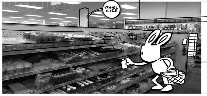
This is the first time I’ve ever drawn a background digitally before, so I had some concerns about whether or not I’d need to go back and hand-draw all the items! I was worried that the organic nature of the figure and the mechanical nature of background lines might be too much of a contrast. But after noodling with it for a while, I realized the color would help bring the two closer together.

starbunny_travelsize_process_4

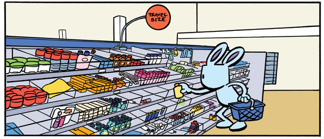
The final inks were sent to Alexandra Graudins, who has been helping with the color flatting on Starbunny, Inc. She always does a great job, and on this page her attention to detail was especially appreciated!

starbunny_travelsize_process_5

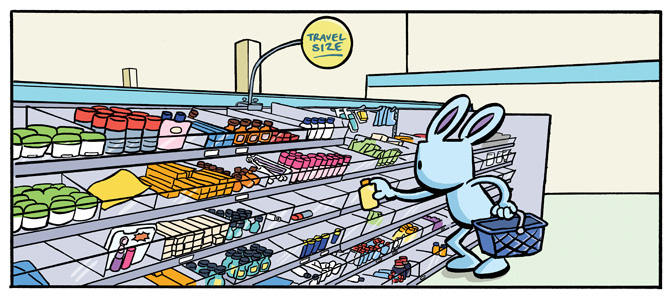
I played around with different color schemes, to avoid the department store looking too similar to Manny’s Appliance Hut, which was already established as having warm reds, oranges, and beiges.  Since this was a silent page, I didn’t have to worry about the type or word balloons. At this point, I was pretty much ready to convert the file to a jpeg and post it on the site to share with you!

You can see the final panel in its sequence HERE!

The Origin of Stars (Ingredients of Starbunny Part 2)

September 2, 2014
blog_starsvideogames

Video game stars: Super Mario, Kirby and Ristar!

A few weeks ago, I wrote a blog post about why bunnies are the protagonists of Starbunny, Inc., so I figured I should also write a post about their co-stars!

The most immediate inspiration is video games, which should come as no surprise to any one who has read Astronaut Academy. The iconography, level designs, textures, and general vibe produced by 8-bit and 16-bit video games are permanently imprinted in my heart, and filter into pretty much all the comics and creative work I’ve produced. Whether as characters, power-ups or just recurring background details, the image of a star, especially one with a face on it, has always been really compelling to me.

Visually, the stars in my comic look the most like the ones that appear in Super Mario Bros., which I started playing in 1986 when I was nine years old. But the stars in Starbunny, Inc. (who don’t offer invincibility so much as constructive criticism) have an inspiration that goes even further back into my childhood.

blog_carebears2

I first discovered the Care Bears in kindergarten (which for me would’ve been about 1982). They were a big phenomenon at the time, and with all the merchandise produced, the stuff that most resonated with me were the notebooks, folders, and metal lunchboxes that my classmates were bringing to school. Much like the Nestle Quik tin canisters, I would stare at the images on these various Care Bears products for hours! My favorite scenes were hand-painted, with visible brush strokes featuring those colorful little bears just kicking back in the clouds, sliding on rainbows and making friends with anthropomorphized stars. Eventually I’d learn from commercials that their cloud home was called Care-A-Lot, and how the bears monitored the feelings of children with a Caring Meter, but at the time, my imagination was content to work out its own logistics, accepting these heart-warming visuals on face value. My main takeaway was that bears who lived in the sky, and smiling stars who hung out during the daytime, made me happy.

I’m glad to say that as I revisit these early images from childhood, they still make me happy. Yes, I know they can be overly saccharine, and I should see through the marketing calculations that created such images. But commercialism aside, I still think there’s something cool about something that is so unapologetically cute! I can’t speak for the later incarnations of the Care Bears or Super Mario Bros., or any similar franchise, but something about their original iconography still gets to me. It gives me a shot of optimistic feeling, and I can only I hope that a similar bit of magic comes through when people read Starbunny, Inc.

blog_carebears1

If clouds can look like pillows, why not stars?


Agnes Quill